Week 14 - Mobile Build & Character Select
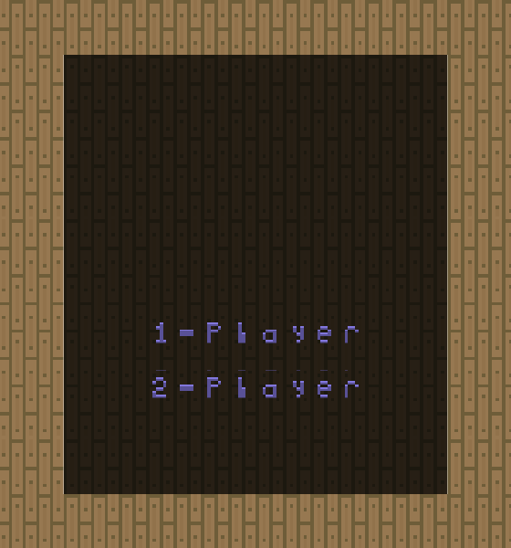
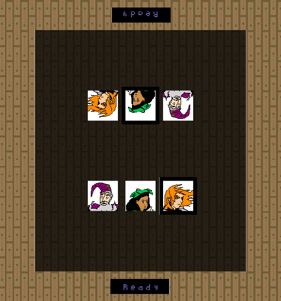
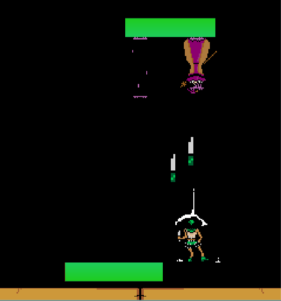
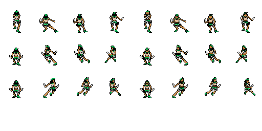
This week I finally got around to building the project for mobile, though only Android at this point. I also built a simple character select menu, main menu (1-player and 2-player) and implemented the Thief and Warrior characters from last time.
The balance of the game is still pretty far off from fair, I’d say the current tier list (because I’m a nerd) is as follows:
S - Thief
A - Wizard
C - Warrior
This is mainly due to how clunky the Warrior is and how much mobility the Thief has, it’s likely to stay this way for a while as I don’t see myself taking any real balance passes until I have all 5 beta-release characters in the game and a far more user-friendly interface.
Altogether this week layed a baseline for the game and from here on out each version and update should be playable and testable which I’m excited about.
It was really motivating to playtest the game a bit on a mobile device, I even got to experience some vs action. This testing helped me nail down my next steps for usability improvements (most of which were fairly obvious before even testing).
As always, the game can be found on it’s itch.io page I’ve also started posting these blog posts as Devlogs on that page in an attempt to possibly foster some discussion (that’s maybe a long shot at this point).
In the coming week I plan on iterating on the menus and User Interface to make the game feel a bit more professional, until then I’ll lay out the terrible first-draft versions of the menus.


Check out more of my weekly projects at https://52weeksofsteve.tumblr.com
Files
Get Barfight
Barfight
A two-button fighting game concept I've been working on. Mainly for mobile
| Status | In development |
| Author | SteveD |
| Genre | Fighting |
| Tags | 2D, Pixel Art |
More posts
- Week 12 - More classes for the barfightApr 09, 2018
- Week 10 - Simple mechanic ideaApr 09, 2018

Leave a comment
Log in with itch.io to leave a comment.